


In Groovy Menu Pro 2.6.5, a selected top-level item can change the background of the entire Classic desktop menu and display the Alternative Logo. You can activate this state on hover or while the item's submenu is open.
1. Create or choose a navigation menu
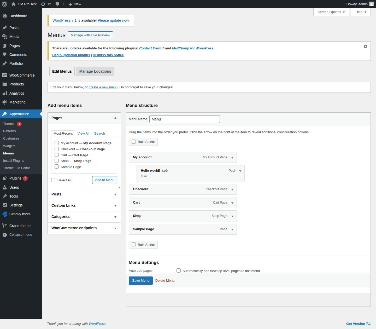
Go to Appearance > Menus. Select an existing menu or click create a new menu. Add the top-level item that should trigger the change. If you want to use the When item is opened trigger, add at least one submenu item below it by dragging that item slightly to the right, or configure a Mega Menu for that top-level item. Click Save Menu.
2. Assign the menu and a Classic preset
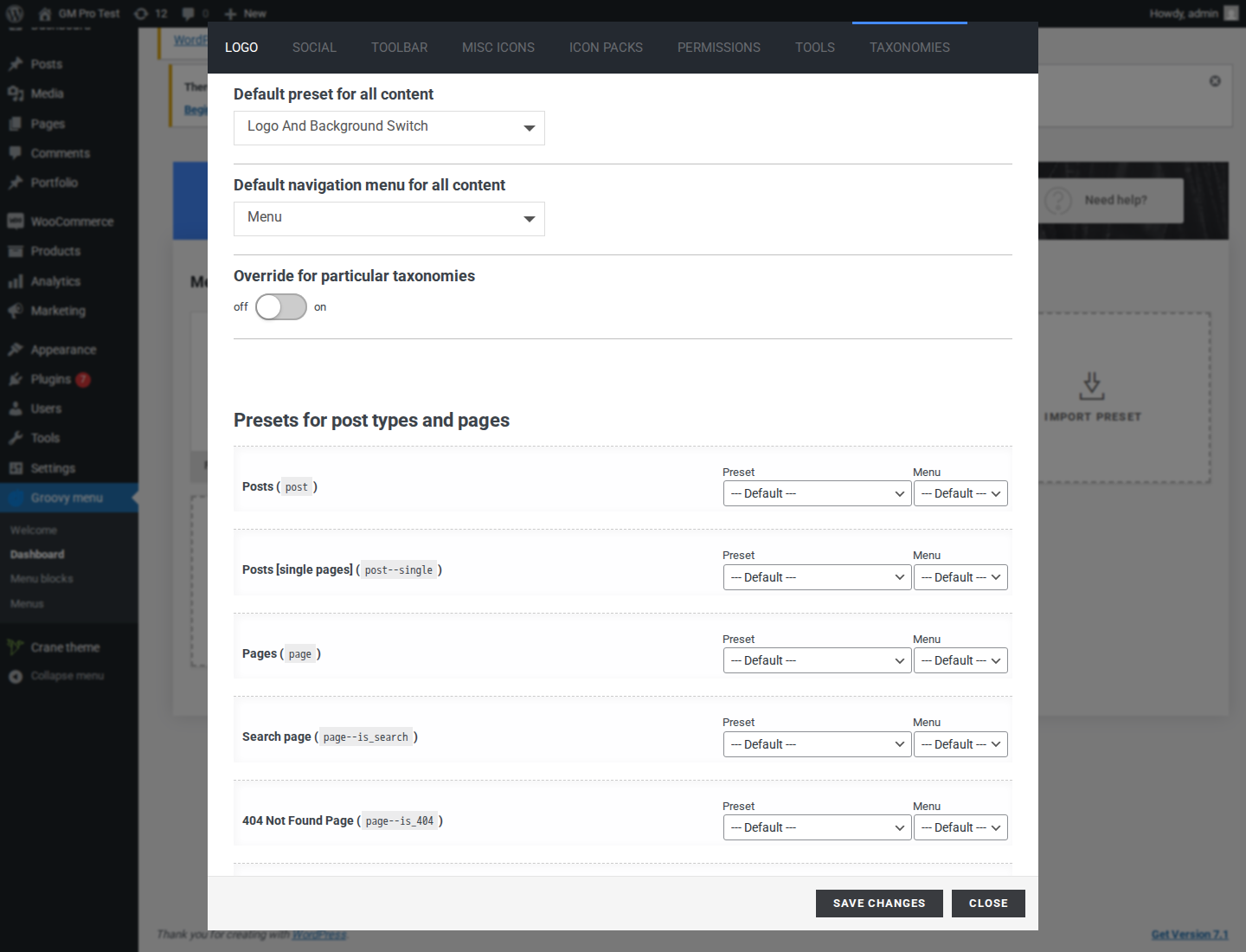
Open Groovy Menu > Dashboard and choose the preset you will use. The selected-item state is available for the Classic desktop menu type. In Global settings > Taxonomies, select it under Default preset for all content and select your WordPress menu under Default navigation menu for all content. Click Save changes. If a page has its own preset or menu override, make sure it uses the same configuration.
3. Upload both logos
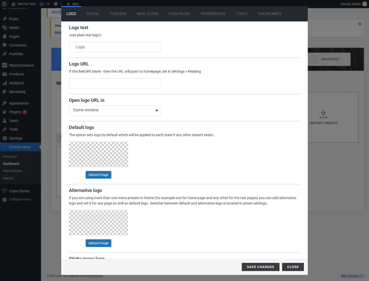
From Groovy Menu > Dashboard, open Global settings > Logo. Upload the Default logo and the Alternative logo, then click Save changes. The Alternative logo is the image that appears when the selected-item state is active.
4. Enable the logo switch in the preset
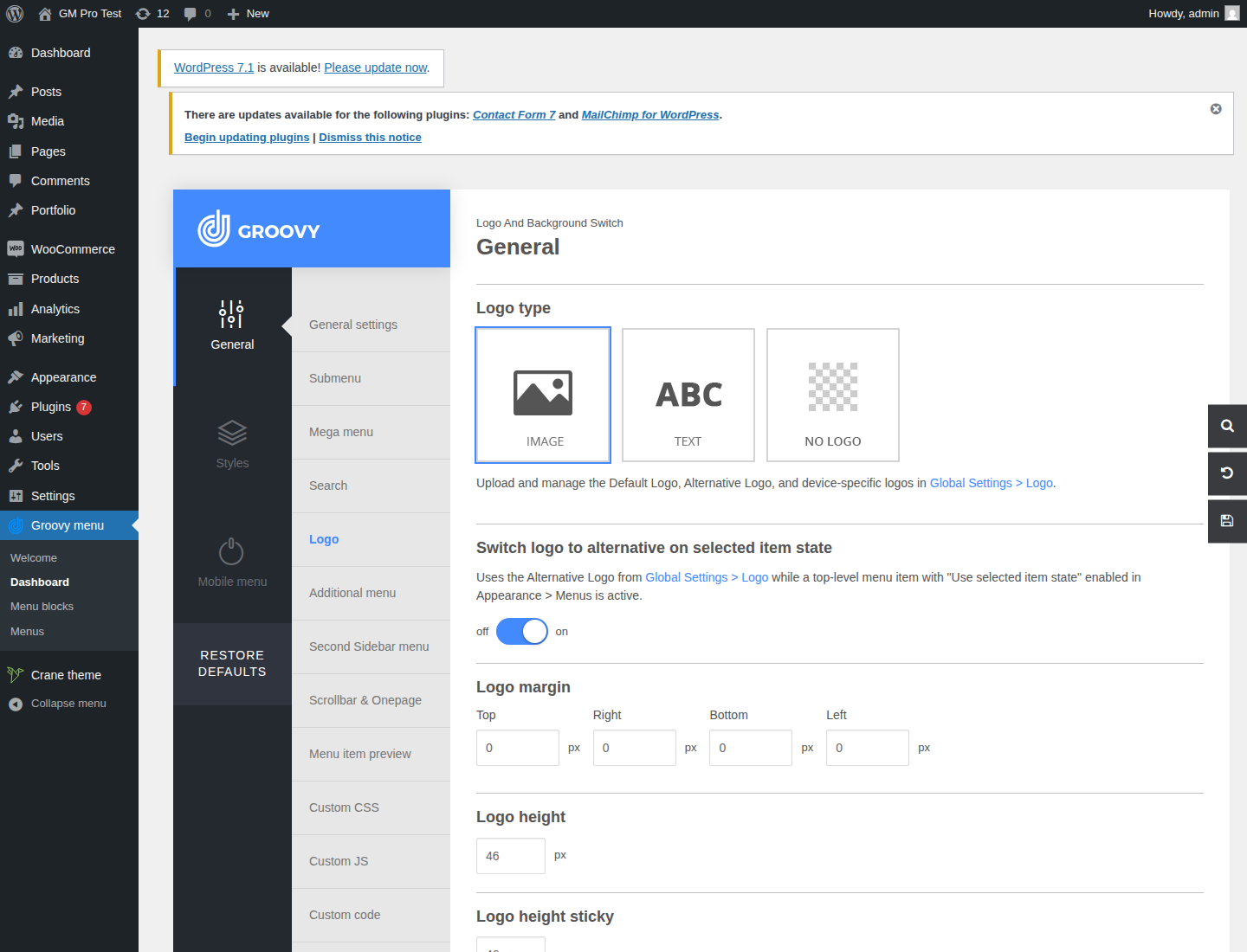
Edit the preset from Groovy Menu > Dashboard. In General > General settings, choose Classic as the menu type. Then open General > Logo, select Image for Logo type, and enable Switch logo to alternative on selected item state.
5. Set the background color and trigger
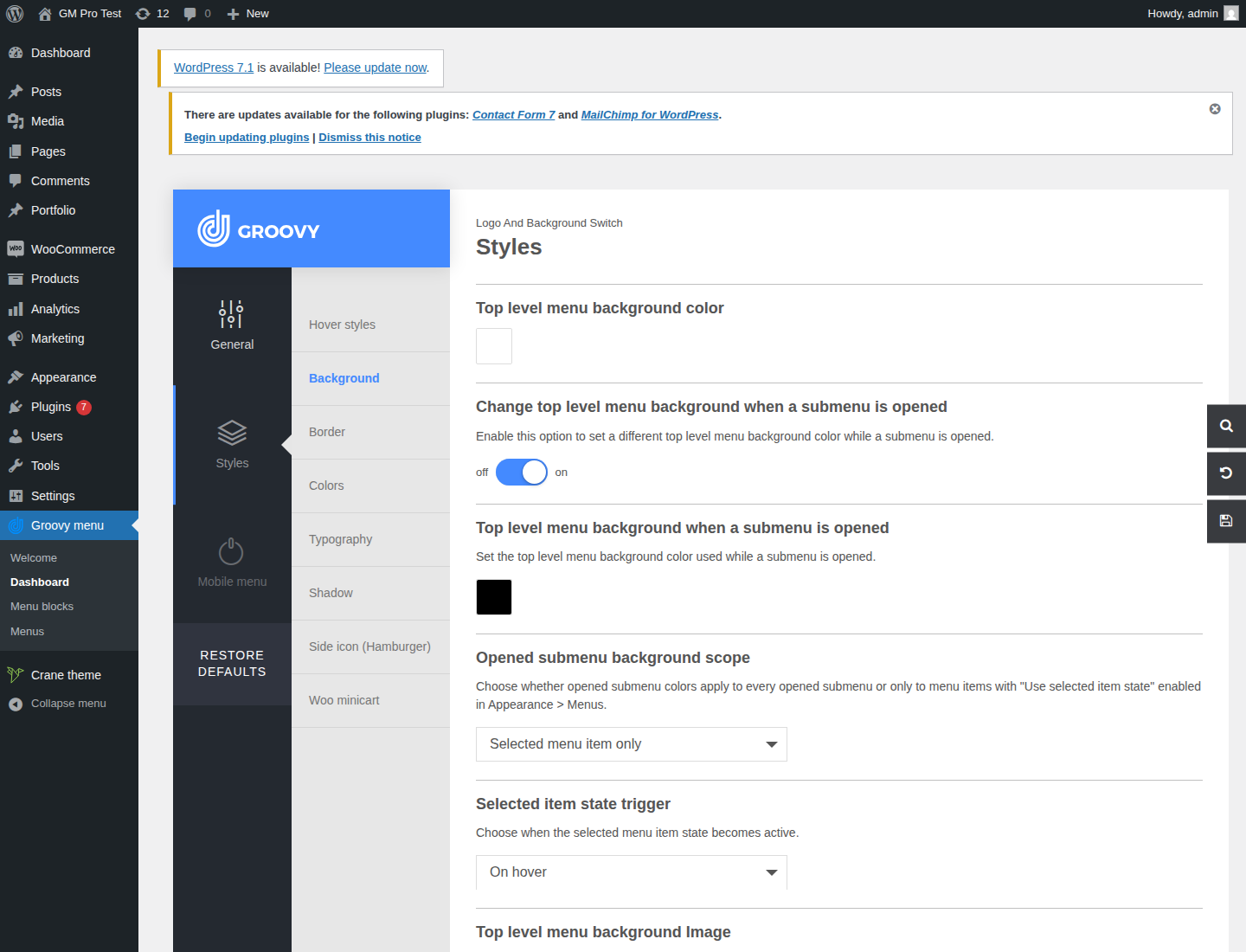
In the same preset, open Styles > Background. Enable Change top level menu background when a submenu is opened, then choose the active color under Top level menu background when a submenu is opened. Set Opened submenu background scope to Selected menu item only. Under Selected item state trigger, choose On hover or When item is opened. Save the preset.
On hover works even when the item has no submenu. When item is opened requires an open Dropdown or Mega Menu. If the sticky menu should use a different active color, also configure Change sticky top level menu background when a submenu is opened and Sticky top level menu background when a submenu is opened.
6. Select the top-level item
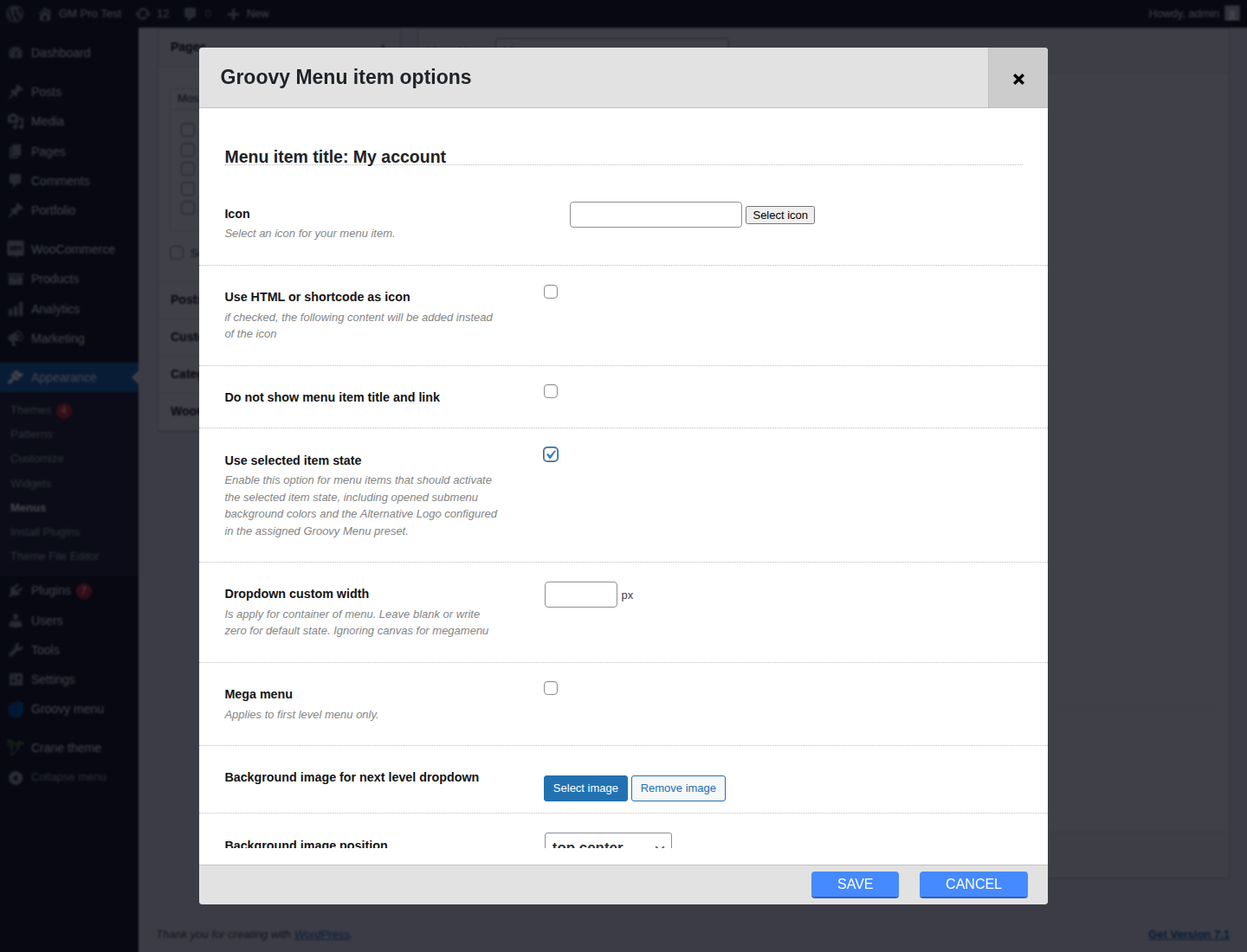
Return to Appearance > Menus, expand the required top-level menu item, and click Groovy Menu item options. Enable Use selected item state and click Save inside that window. Click the WordPress Save Menu button as well if you changed the menu structure. The WordPress button alone does not save settings inside the Groovy Menu item options window.
Check the result
Open the site on a desktop and hover over the selected item, or open its submenu, depending on the trigger you chose. The top-level menu background and logo should change together. If nothing happens, check that the correct menu and Classic preset are assigned, the Alternative logo is uploaded, and Use selected item state is enabled on that item. If the site uses a page or asset cache, clear it after saving the preset.